Hostinger AI Website Builder Tutorial | How to Launch Your Site with AI Tools Easily
“Hostinger AI Website Builder Tutorial Unlock the potential of Hostinger’s AI Website Builder in 2026! Follow our step-by-step tutorial for effortless website”
How to Make a Website With Hostinger
(Fast, Simple, and Actually Kind of Fun)
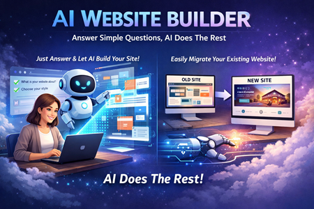
If you’ve been meaning to build a website but keep putting it off because it feels like “a whole thing,” you’re not alone. A lot of people start, get overwhelmed, and quit halfway through. The good news: building a basic site doesn’t have to be complicated anymore—especially if you use an AI builder and stick to the basics.
This walkthrough shows how the process looks from the inside, including the parts most beginners get stuck on: creating pages, linking buttons, styling sections, checking mobile, and finally hitting publish. If you want to follow along with the same tool, Hostinger is the platform being used.
Getting started: where the website actually begins
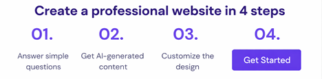
Once you’re logged in, everything starts from the Websites tab. The main button you’re looking for is usually something like Create or migrate a website.
From there, you’ll get two choices:
- Migrate a site you already have
- Create a new site (this is what most people want)
Next, you choose how you want to build:
- AI Builder (beginner-friendly, quick)
- WordPress (more flexible, but requires more know-how)
For a first site, AI Builder is the easiest path. You can also usually use the free domain included with your plan, so you don’t have to stop and buy one right away.
AI builder vs templates: pick your starting point
After a short load, you’ll see two options:
- Let AI generate a site based on your description
- Choose a pre-made template and customize it
Templates can be great, but the AI option tends to feel more “made for you,” because it’s built around your brand name and description.
The one thing that matters most: your description
You typically get a big text box (up to around 700 characters) to describe your site. Don’t overthink it, but do give it enough detail to steer the design.
Include stuff like:
- What your site is about (blog, portfolio, business, etc.)
- A simple “who it’s for”
- A few key sections you want (Home, Projects, Contact, etc.)
Then you hit generate and let the builder create the first version.
The editor basics: where everything lives
Once your site is generated, you’ll land in the editor. On the left, you’ll see the main tool areas:
- Elements (drag-and-drop stuff like text, images, buttons, videos, forms)
- Pages (your site navigation and page list)
- Style (colors, fonts, button styles, animations)
- Blog / Store (optional features you can add or remove)
- AI tools (logo maker, writer, heat map, language settings, search)
The vibe here is “mess around and learn.” You don’t need to memorize anything—most of it is click → edit → adjust.
Building it out: pages, buttons, and layout
A very common first upgrade is adding a second page and linking a button to it.
Add a page
Go to Pages → Add new page → name it something like “Projects” or “About.”
Link a button to that page
Click the button → Edit button → choose the page under the link option.
From there, you can also tweak:
- Font size
- Border width
- Corner radius (rounded vs boxy)
- Hover color (what happens when someone mouses over)
That hover effect matters more than people think. A small change can make the site feel more “real” and less like a template.
Styling: colors, fonts, backgrounds, and spacing
This is where your site starts looking like yours.
Useful quick wins:
- Change your font to something clean and readable
- Adjust section spacing so things aren’t cramped
- Add a background image and lower opacity so text stays readable
- Update button colors so they don’t clash with your background
And if something looks “clustered,” the simplest fix is often just adding a blank section as breathing room.
Add extras: social links, forms, and a map
Once the basics are set, you can drop in useful elements:
- Social icons (link to Instagram, YouTube, etc.)
- A contact form (so people can message you)
- A map (if location matters)
You can resize and reposition everything by dragging, and you can preview changes without worrying about breaking the live site.
AI tools: the heat map is the sneaky useful one
Some AI tools are optional fluff, but the AI heat map is interesting. It predicts where visitors are likely to focus (buttons, interactive elements, form submit areas), which helps you place your most important call-to-action in the spots that get attention.
Is it perfect? Probably not. But it’s a decent guide when you’re not sure where to put “Contact,” “Buy,” or “Learn more.”
Mobile preview and going live
Before publishing, switch to mobile view and make sure nothing looks weird. Then hit Go Live. Your site becomes accessible on the web, and your buttons/pages should work exactly as previewed.
You can also choose whether your header is sticky (stays visible while scrolling) or not, depending on how you want the layout to feel.
AI makes website creation a breeze!